Poster advertisements
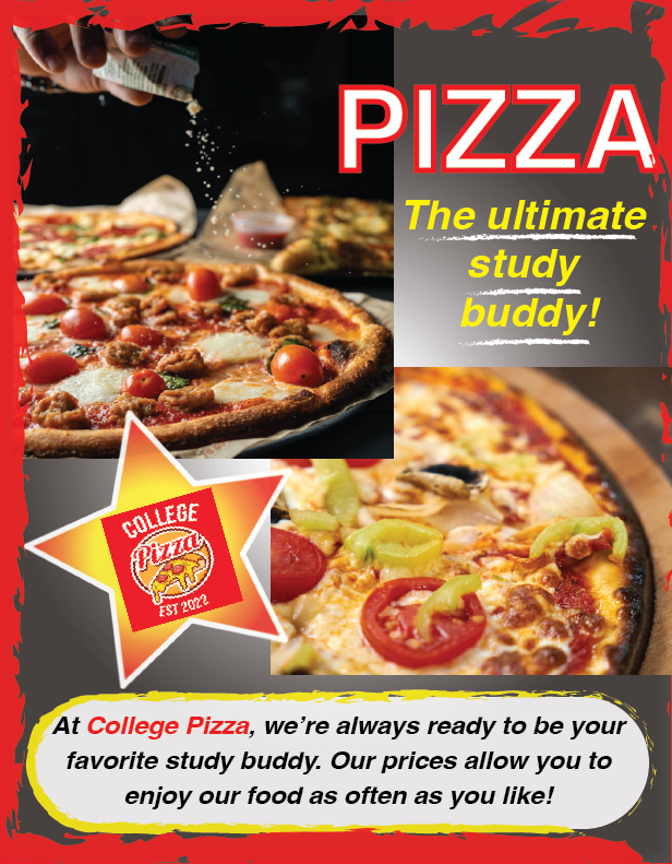
I designed this advertisement for College Pizza, a business that aims to attract more college-aged customers. They wanted an engaging ad that captures attention with enticing pizza images while showcasing their unique brand identity, ultimately boosting customer engagement and fostering a loyal following. I adhered to their brand colors, messaging, and images to create a design that is distinctly aligned with their brand identity, attracting their young audience.
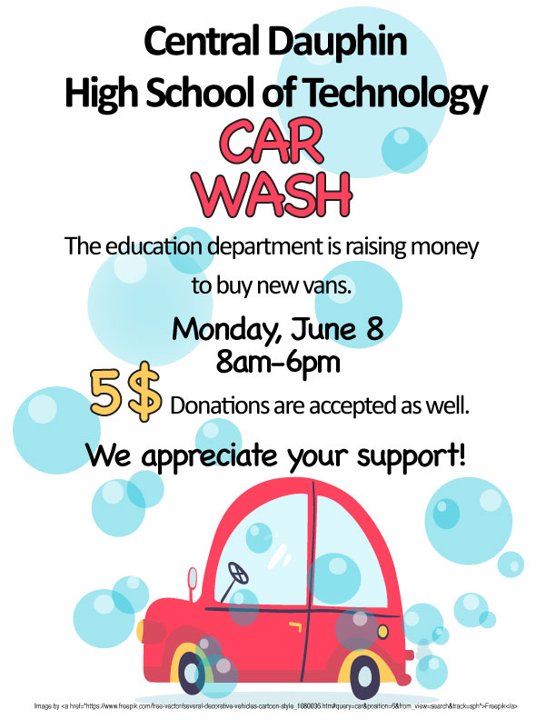
I created this print advertisement targeting high school students to encourage community members to contribute to their high school’s purchase of new vans. My design process focused on using bright colors, along with images of soap bubbles and a cartoonish car to add a fun element. I highlighted the event in red and the dollar amount in yellow to attract the viewer’s attention, while ensuring the layout remains clear and inviting.
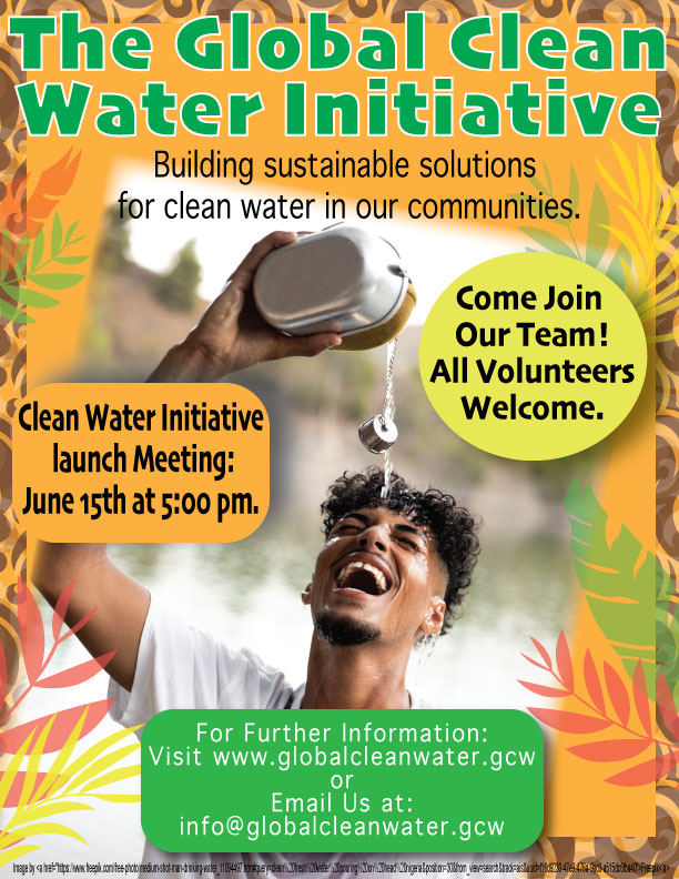
I designed this poster to empower African communities by raising awareness and sparking action around the urgent issue of freshwater scarcity. By researching diverse African cultures, I tailored the style, imagery, and color scheme to resonate deeply with the audience.
Infographics
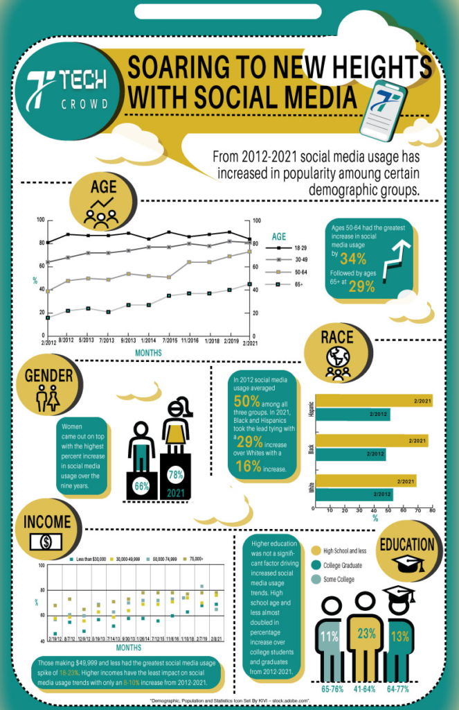
I designed an infographic for the tech company Tech Crowd that highlights social media popularity trends among demographic groups. Target audience: Age 28-45, men and women whose interests are business and technology. The graphs, color theme all align with Tech Crowd’s brand style guide, enhancing brand recognition and consistency. Additionally, incorporating illustrations and icons not only adds visual appeal but also helps reduce text overload.
Catalog design
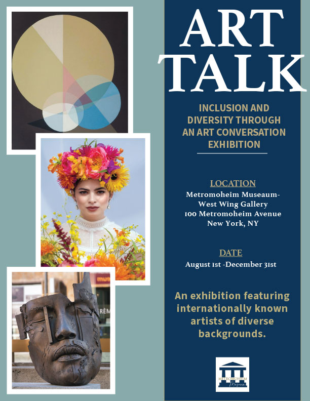
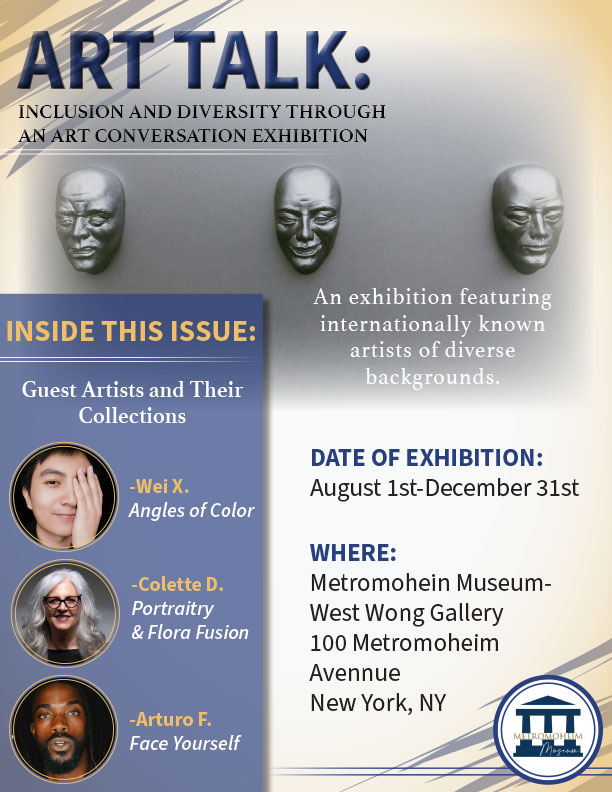
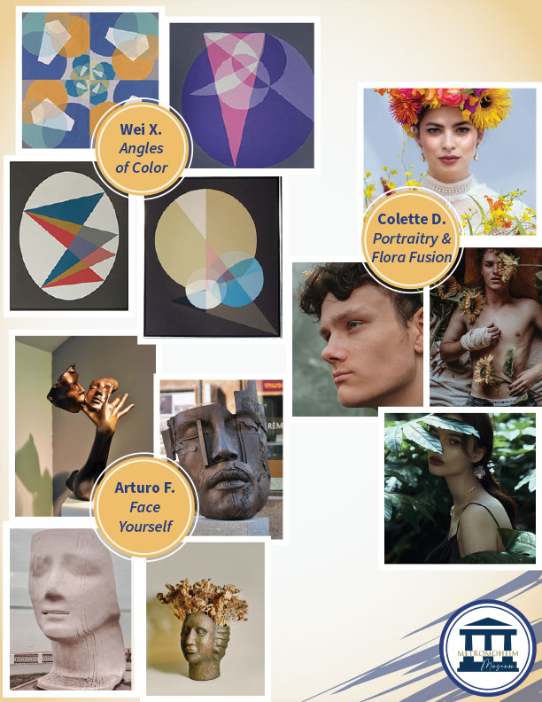
The Metromoheim Museum was hosting an exhibit featuring three diverse artists. They wanted a catalog and newsletter layout design for the public that highlights these artists and encourages visitors to come to the museum to experience their creative works in person. The target audience includes people of all ages who have an interest in art. The layout effectively establishes a clear hierarchy, and the typography and flow of information are highly legible. The color scheme is inviting and well-balanced, avoiding an overwhelming effect. Additionally, the style conveys a professional and sophisticated tone that aligns with the brand’s identity. Collectively, these elements contribute to a positive user experience.
Trifold brochure design
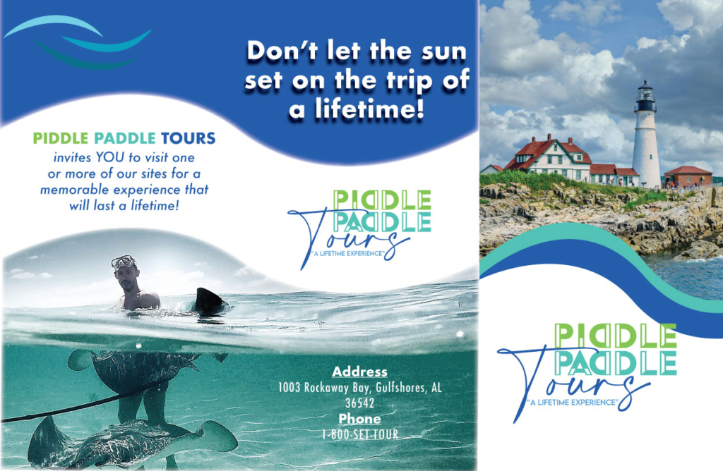
Piddle Paddle Tours is a company seeking a solution to engage and attract vacationers interested in a nautical adventure experience. To achieve this, I designed a handy trifold brochure that easily fits into anyone’s purse or pocket. To capture the nautical essence of Piddle Paddle Tours, I based the design on their brand style guide. The color scheme, logo, and imagery all work together to reflect their brand identity. The layout, along with its use of imagery, guides the viewer’s eyes and encourages exploration of the various activities offered.
Book Cover Design
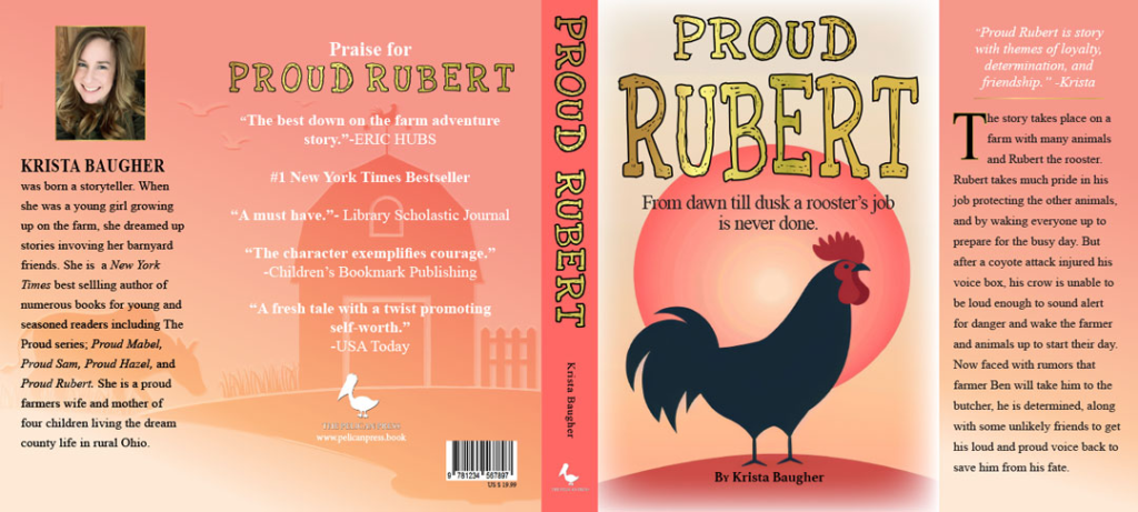
I had the opportunity to design a book cover, drawing inspiration from one of my favorite genres: classical children’s novels like “Charlotte’s Web.” This led me to create “Proud Rubert,” a captivating tale about Rubert the rooster, who fiercely protects his beloved farm at all costs. The cover is bright and energetic, perfectly reflecting the uplifting spirit of the story.
Brand logo design/style guide
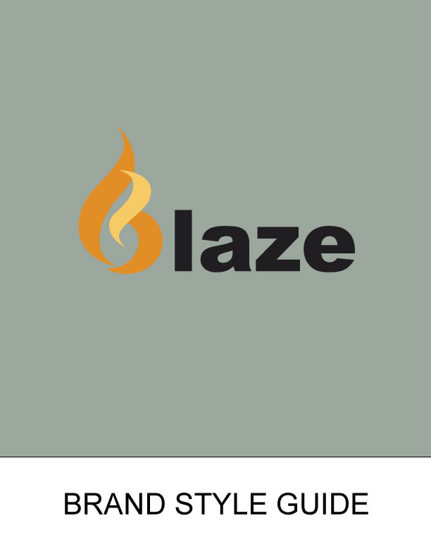
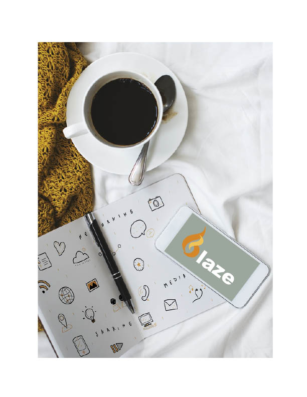
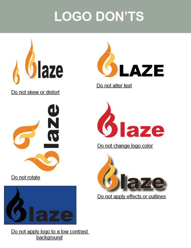
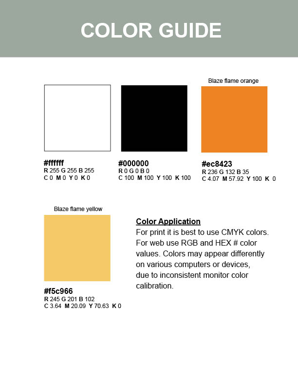
Blaze is a dynamic social media platform designed for individuals seeking to form meaningful connections with others. To represent their innovative brand, they required a logo that captures the essence of igniting social interaction. I creatively styled the “B” to resemble a flame, which serves as both a striking logo and a versatile icon. This streamlined design not only enhances brand recognition but also embodies the spirit of connection that Blaze stands for.
Multichannel advertising campaign
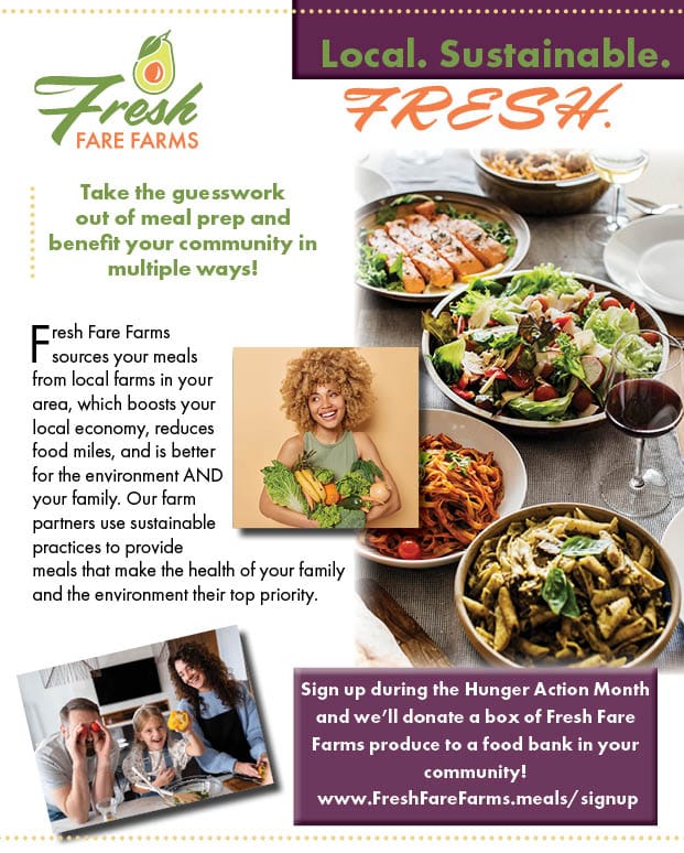
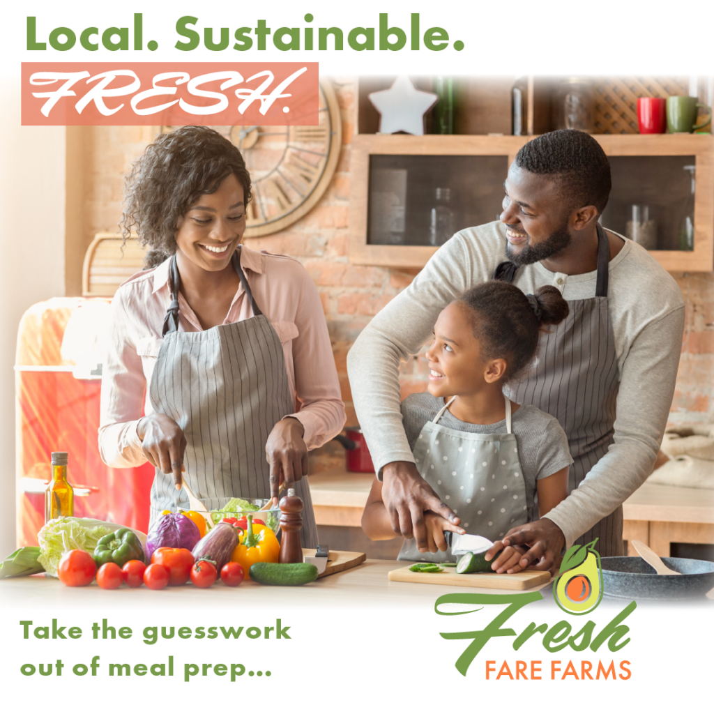
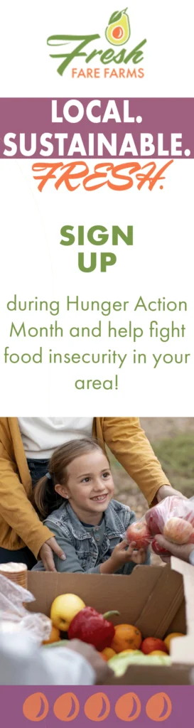
Fresh Fare Farms is a locally sourced meal delivery service that aims to expand its reach to busy customers, particularly young families who have limited time to prepare nutritious meals. My goal was to captivate a diverse audience via a mulit channel advertisment campiagn. By utilizing various forms of media, we can enhance brand awareness and cultivate meaningful connections with our audience. Furthermore, I had the opportunity to select images, especially those that reflect the target demographic for this campaign, and to utilize typography and color themes from the brand style guide to create a cohesive design. The right image features a digital skyscraper advertisement with a flashing animated sign-up button designed to attract viewers and increase engagement.
Animated digital advertisement

I created an animated advertisement for Scoop Shoppe to boost their brand visibility and attract new customers on social media and digital platforms. The engaging effects capture attention and direct viewers to the “Order Now” button, increasing user engagement. The fun layout invites curiosity, as seen with a girl gazing eagerly at a large ice cream cone. These elements are designed to awaken cravings and drive sales.
Website design
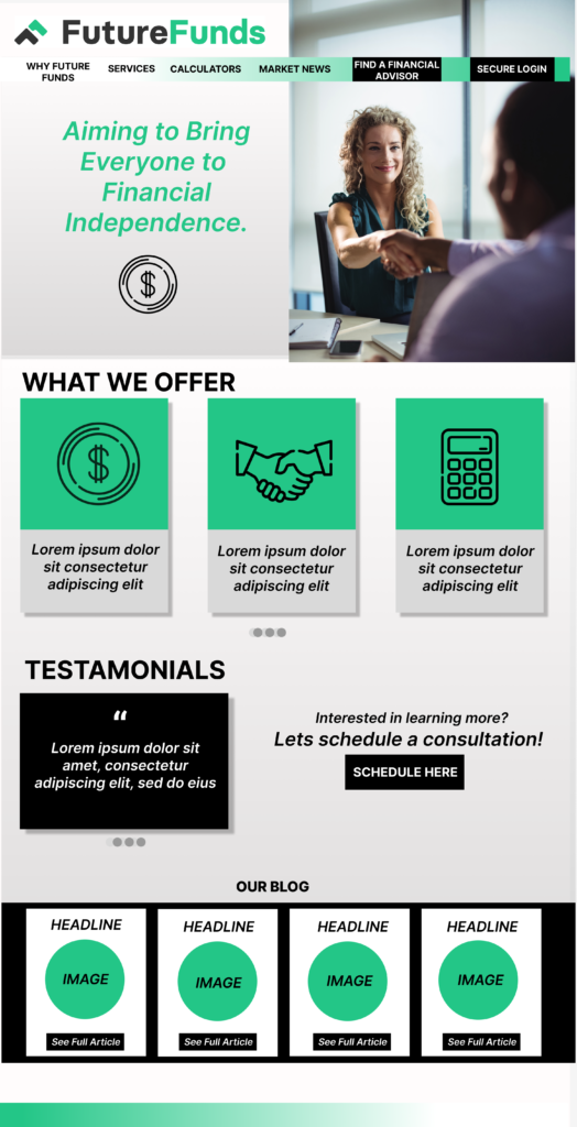

Future Funds needed a user-centric website landing page that resonates with their target audience. The overall concept of the high-fidelity mock-up website and mobile landing pages emphasizes the importance of maintaining brand cohesion and consistency across different screen sizes. The layouts were strategically designed to ensure that users experience the same visual context, regardless of the device they are using, allowing them to complete their intended tasks seamlessly. Additionally, the layout prioritizes user-friendliness and ease of navigation. The brand’s color theme is consistently applied throughout the designs to highlight certain elements, fostering unity and cohesion. Imagery is utilized to create an emotional connection with users, while icons effectively communicate meaning, enhance functionality, and improve aesthetics.